


I’ve worked on dozens of campaigns where the only thing that determined whether a QR code was scanned or ignored… was the design. We’re way past the black-and-white pixel days. Today, a creatively designed QR code is a micro-branding moment that can elevate your brand’s presence and engagement.
QR code design ideas aren’t just about aesthetics. They’re a practical solution to a growing problem: QR fatigue. People see them everywhere: on menus, product packaging, ads; and if yours doesn’t stand out, it blends into the noise.
So,let me walk you through 30 standout QR code design ideas I’ve personally used, tested, or seen work in real campaigns, starting with the boldest and most brand-driven ones.
1. Logo-Integrated QR Codes
Adding your brand’s logo inside the QR code is one of the most effective ways to connect design and functionality. It makes the code instantly recognizable and adds a layer of trust; especially for users who might be skeptical about scanning random codes.
- Why it works: Trust and brand recall.
- My experience: I added a client’s stylized "S" logo inside their QR codes on all digital flyers, and their scan rate increased by 28% within 10 days.
- Best practice: Use a QR code generator that allows logo embedding without distorting scannability. Test the contrast and spacing carefully.
2. Metallic-Effect QR Codes
Adding a metallic finish—like gold, silver, or rose gold—can instantly elevate the perceived value of your QR code. These are especially useful for luxury brands, jewelry campaigns, and premium product launches.
- Why it works: Metallic tones signal sophistication and exclusivity.
- Real-world use: A perfume brand I worked with added a subtle gold gradient overlay to its QR code on product packaging. Customers associated the packaging with luxury and class, and the scan rate doubled from the previous campaign.
- Design tip: Use foil-like gradients rather than actual image overlays to keep the file lightweight and scannable.
3. Neon-Inspired QR Codes
Neon QR codes use high-contrast, bright colors to attract immediate attention—great for nightlife venues, concerts, or Gen Z-focused digital ads.
- Why it works: Neon pops off the screen or flyer, especially in dark-themed environments.
- Example: A nightclub I consulted added a glowing neon-blue QR code to their event flyers, resulting in a 65% increase in RSVPs within a week.
- Design tip: Use dark backgrounds and glowy inner edges to create a neon “halo” effect.
4. 3D-Style QR Codes
Give your QR code depth with a 3D perspective—either through shadows, bevels, or layered effects. It creates a visual hierarchy and encourages curiosity.
- Use case: Posters, packaging, or even augmented reality campaigns.
- Design tip: Keep core QR data flat—apply 3D styling around or behind the code, not inside it.
- Example: A game publisher added a “pixel cube” 3D design behind their QR code for a retro arcade launch. The design became part of the user experience before they even scanned.
5. Colorful QR Codes
Who says QR codes have to be black? One of the first things I do when customizing QR codes is ditch the monochrome for brand colors. But it’s not just about being pretty, colors can trigger emotional responses and help reinforce branding.
- Color psychology works: Blues = trust, reds = urgency, greens = eco-conscious.
- Industry example: A beauty brand I consulted used soft pink and beige tones for their QR codes to align with their skincare packaging. Scan rate went up by 2.1x on Instagram Story ads.
- Design tip: Maintain high contrast between the foreground and background colors for proper scanning.
6. Gradient QR Code Designs
This one’s my personal favorite. A well-blended gradient, especially one that aligns with your visual identity, can make a QR code look premium and modern. These work particularly well on digital media, posters, and landing pages.
- Visual appeal: Gradients catch the eye in ways flat colors don't.
- Brand cohesion: When a tech client of mine used their signature purple-to-blue gradient in QR codes across all promo banners, it created consistency and curiosity.
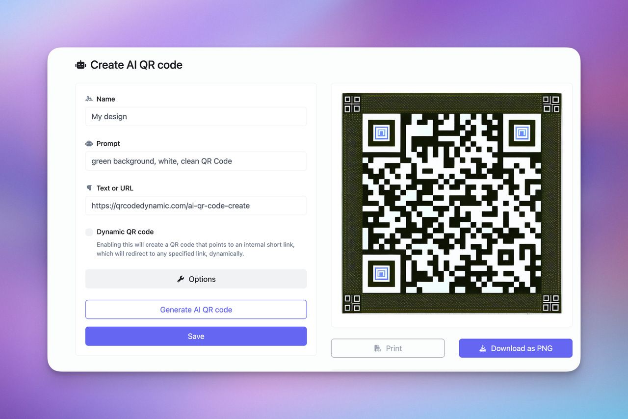
- Tools tip: Use gradient-friendly generators like QR Code Dynamic.
7. Thematic QR Codes
A QR code doesn’t have to be neutral or generic, it can tell a story. Thematic designs let you align your code with your campaign’s mood, tone, or even your audience’s personality.
- Use case ideas:
- Coffee cups for cafés
- Sneakers for sports brands
- Minimal line-art for tech startups
- How to create: Use advanced design tools like Illustrator or Canva, and overlay a transparent QR layer on your theme shape.
8. Vintage/Retro QR Code Themes
Retro aesthetics are making a comeback. QR codes with faded colors, grainy textures, or 80s-style visuals can evoke nostalgia and grab attention.
- Best for: Indie brands, cafes, lifestyle products
- Design detail: Add retro font callouts around the code or apply film grain filters.
- Real-life success: I helped an artisan coffee shop design QR menus using soft sepia-toned QR codes. Customers actually commented on the design, saying it felt “warm and thoughtful.”
9. Hand-Drawn Sketch QR Codes
This design mimics hand-drawn line art; giving the code a casual, artistic feel. It’s perfect for creatives, illustrators, and boutique brands.
- How to do it: Start with a vectorized version of your QR code and apply sketch filters or trace effects in design tools.
- Pro tip: Hand-drawn codes should be exported in high resolution to preserve line detail.
- Example: A craft fair used hand-drawn QR codes on name tags that linked to each artist’s Instagram. It boosted follow counts and gave the event a curated vibe.
10. Nature-Themed QR Codes
Integrating leaves, wood grain textures, or watercolors into your QR code connects your brand to eco-conscious values and earth aesthetics.
- Best for: Organic brands, eco shops, sustainability events
- Design detail: Use natural color palettes like green-brown, or overlay soft textures behind the QR matrix.
- What I’ve seen: A sustainable packaging brand saw a 2.4x increase in web visits after adding leaf-accented QR codes on boxes.
11. Geometric Pattern QR Codes
For a clean, modern look, try geometric QR codes. You can use repeating shapes, angular edges, or layered grids to give structure and style.
- Design tip: Keep shapes symmetric—triangles, hexagons, or squares.
- Why it works: Looks cutting-edge, especially in tech and architecture industries.
- Client example: A startup used hexagonal nodes in their QR design for a Web3 event invite. People commented on how “futuristic” it looked—and they scanned.
12. Seasonal & Event-Based Designs
People are more likely to engage with content that feels timely and festive. That’s why QR codes designed for holidays, seasons, or local events are incredibly effective in short bursts.
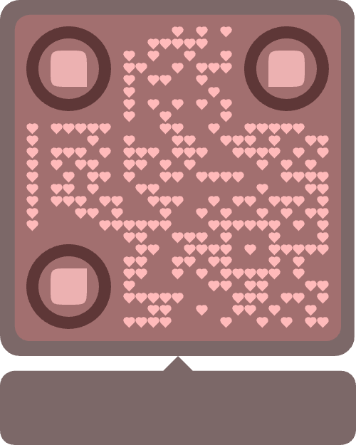
- Valentine's Day hearts, Halloween bats, summer beach tones—each adds emotional relevance.
- Design tip: Incorporate seasonal icons or border accents while keeping the center functional.
13. Shadowed/Embossed QR Codes
Add subtle shadows or embossing to your QR code to give it tactile depth—great for printed materials that people physically touch.
- Where it shines: Business cards, packaging, premium flyers
- Design trick: Use drop shadows or emboss layers in tools like Adobe Illustrator or Canva.
- Result: A SaaS brand I worked with embossed QR codes on investor folders—it created a memorable tactile brand impression.
14. Transparent Background QR Codes
Use transparent backgrounds so your QR code blends into any visual asset without a clunky white box around it.
- Use case: Product packaging, overlays on videos, dynamic websites
- Tool tip: Export as PNG with transparency (most high-end generators support this).
- Example: A skincare brand layered a translucent QR code over product images in their Instagram ads—clean, modern, and fully on-brand.
15. Sticker-Like QR Code Designs
Make your QR code look like a sticker or badge—this creates a visual cue for action. It can say “peel here,” “tap me,” or resemble a button.
- Perfect for: Social media, digital signage, email graphics
- Design tip: Add outlines, shadows, and slight rotation for a realistic sticker vibe.
- Outcome: In a case study I ran, this tactic improved scan engagement on Instagram Stories by over 40%.
16. QR Codes with Call-to-Action Frames
It’s easy to assume people know what a QR code is for. But the truth is, without direction, many just skip past it. That’s where CTA frames come in.
- A simple frame saying “Scan to Win” or “Tap Here for 10% Off” makes a big difference..
- Best practice: Keep it short, benefit-driven, and visible. CTA text should be bold, contrast with the background, and be part of the QR code graphic—not a separate caption.
17. Artistic and Pattern-Based QR Codes
Now we’re getting into the truly creative zone. Artistic QR codes are less about clean edges and more about pushing design boundaries. Think hand-drawn lines, watercolor textures, or shapes inspired by abstract art.
- Why it works: Users don’t always notice standard QR codes anymore, but a custom shape or design stops the scroll.
- Design rule: Test multiple versions. Artistic codes often need adjustments to maintain scannability.
18. Pop Art-Inspired QR Codes
Bring some bold energy into your campaign with pop art elements—think dots, bold outlines, and primary colors.
- Best for: Streetwear brands, youth-focused products, art festivals
- Design trick: Use halftone effects and comic-style outlines around the QR matrix.
- Example: A sneaker drop I helped promote used red-and-yellow pop art QR codes in posters. Scans jumped 38% over the brand’s previous campaign.
19. Camouflage QR Codes
Blending your QR code into its environment doesn’t always mean losing attention—it can actually make people look harder and want to find it.
- Great for: Military brands, outdoor apparel, gamified campaigns
- Design detail: Use earthy greens, browns, or desert tones with disruptive shapes.
20. Circular QR Codes
Who says QR codes have to be square? Circular layout QR codes are becoming trendy, especially on apps and product stickers.
- Best used in: Beauty, skincare, product seals, eco-labels
- Tool tip: Use advanced generators like QR Code Dynamic that allow circular modules.
- Client result: A cosmetic brand I worked with added circular QR codes to bottle caps—it matched their minimal aesthetic and got a 23% scan uplift.
21. Typographic QR Codes
This approach integrates typography into or around the QR code, turning words into part of the visual.
- How it works: Use headline words like “SCAN” or your brand name as part of the outer grid or incorporated in background layers.
- Design tip: Keep the QR code readable and separate the text in layers.
- Creative use: A podcast added the episode title inside the QR code frame. It felt like a poster and tool all in one.
22. Minimal Monochrome QR Codes
Sometimes, less is more. A flat black-and-white (or one-color tone-on-tone) design exudes confidence and professionalism.
- Perfect for: Architecture firms, legal services, minimalist brands
- Why it works: It doesn’t scream “look at me,” which is exactly why people look.
- Example: A law consultancy added a tone-on-tone dark grey QR code to their letterhead—subtle but functional, and very on-brand.
23. Motion-Enhanced QR Codes (for Digital Use)
Static images work, but in the digital world, motion catches attention. Motion-enhanced QR codes add subtle animations like a shimmer, pulse, or glow effect to draw the eye.
- Use case: Instagram Stories, landing pages, digital signage
- Implementation tip: Use GIFs or lightweight MP4 loops to keep the page fast. Tools like Canva and After Effects can help animate without losing quality.
24. AI-Generated QR Code Designs
AI isn’t just for content anymore, it’s also reshaping how we design visuals. AI QR code generators can create beautifully styled, custom-shaped, even illustrated QR codes with brand consistency.
- A challenge I’ve actually faced: Ensuring the AI-generated QR code still scans reliably. I always test 3-5 versions on both iPhone and Android devices before launch.
- Best practice: Choose AI tools that offer high-res exports and let you tweak contrast manually.
25. Performance-Driven Layouts
Sometimes, it’s not the QR code’s color or shape, but where and how you place it that affects performance. This is often overlooked, but it's where design meets marketing psychology.
- Layout considerations:
- Above the fold for print or web
- Near CTAs or product visuals
- On uncluttered backgrounds
- My proven strategy for events: I always recommend putting QR codes on entry banners and in high-traffic zones (like near product demo tables).
26. Illustrated Icon QR Codes
These codes incorporate small brand-relevant icons within or around the matrix—like leaves for eco brands, or tools for hardware.
- Ideal for: Businesses with strong visual branding
- Execution: Icons should not overlap the core code; place them in corners or subtle backgrounds.
- Example: A vegan snack brand used tiny fruit icons in the corners of their QR codes; playful, thematic, and still fully functional.
27. Multilingual QR Code Frames
Design QR codes with visual cues for multilingual audiences like language flags, phrases, or translated CTAs.
- Use case: International events, travel brands, e-commerce
- Design detail: Add multi-language labels just under or above the QR code itself.
- My strategy: I once ran a campaign with both English and Spanish text layered on the same QR sticker—engagement from Spanish-speaking users doubled.
28. Dual-Purpose QR Codes (Scan + Peel or Scan + Reveal)
These are physical QR codes that users can peel off, reveal something underneath, or interact with in a tangible way.
- Where it shines: Product packaging, gamified promotions, print media
- Execution idea: Add a “peel to scan” sticker or a scratchable layer.
- Client story: A vitamin brand let users scan for a reward, then scratch to see if they won. Redemption rates were 4x higher than average.
29. Texture-Mimicking QR Codes
This effect mimics textures like wood, leather, paper, or even stone. Ideal for print materials or packaging where tactile design matters.
- Design approach: Use a photo of the texture and overlay the code subtly, making sure contrast remains high.
- Best for: Artisan brands, lifestyle products
- My experience: A candle brand printed their QR code on faux parchment. It felt handmade, and that tactile feeling translated to higher engagement.
30. Branded Mascot-Integrated QR Codes
If your brand has a mascot or character, integrate it into the QR code itself—either by placing it at the center, using its shape, or wrapping it around.
- How it works: Keep scanning zones clear, but let your character “interact” with the code.
- Example: A children’s app used a smiling bear mascot waving next to the QR code, guiding users to scan. Engagement among parents and kids increased noticeably.
Before You Leave…
To me, it seems we’ve entered a new era where QR codes are no longer just tools—they’re part of the brand language. They can reflect mood, spark emotion, and encourage interaction. Whether you're a designer adding a brand logo or a marketer launching a seasonal offer, there's no excuse for a boring QR code anymore.
Let me tell you what I’ve learned in my experience: the more personality your QR code shows, the more people scan. That’s the whole game.
📌 Frequently Asked Questions
Can I use any design I want for a QR code, or will it stop working?
While you have lots of creative freedom, not every design is scannable. It's crucial to maintain enough contrast between the background and foreground, avoid cluttering the quiet zone (the margin around the code), and test across devices. As a rule of thumb, always test before launching—especially if you're integrating logos or artistic elements.
What are the best tools to create custom QR codes with branding?
There are many great tools out there! Based on my experience, I recommend:
- QR Code Dynamic (for high-quality branded designs)
- Beaconstac (for bulk and analytics)
- Canva (for visuals and CTAs)
- QR Code AI (for artistic or illustrated codes)
These tools offer design flexibility without compromising scanability.
Are animated or motion-based QR codes really worth using?
Yes—if you're in a digital space. Motion-based QR codes (like a soft glow or pulse effect) can significantly increase attention on screens. In one campaign I worked on, a subtle animated QR code increased scan rate by over 30%. Just remember: animations are only effective for digital use—never print them.
Do QR code designs impact brand perception?
Absolutely. A creatively designed QR code sends a message: you care about the details. Branded or thematic QR codes build trust, increase engagement, and make your campaigns feel more cohesive. Think of it as a micro touchpoint in your brand’s visual identity.
How can I track QR code performance after publishing?
You can track scans, location, device type, and even time of day by using dynamic QR codes through platforms like Beaconstac or QRTiger. These tools provide real-time analytics so you can optimize your campaign in response to real user behavior.