


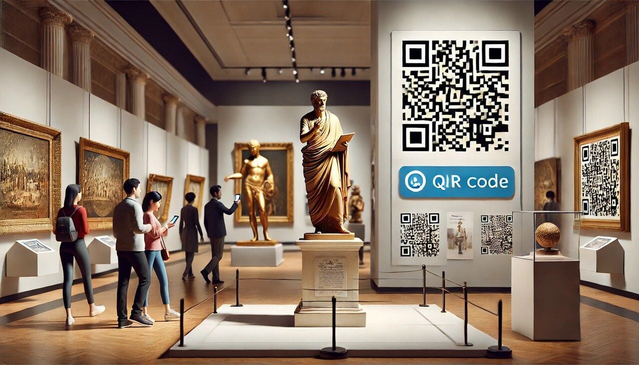
QR codes for museums turn static labels into interactive doorways. Visitors scan a code next to an artifact and get audio commentary, translations, AR overlays, donation prompts, or curator videos. Place codes at exhibit labels, entrances, gift shops, and event signage, then link each one to mobile-friendly pages built for short attention spans.
What Are QR Codes for Museums?
A QR code for a museum is a small printed square that opens a digital experience the second a visitor points their phone at it. The phone reads the pattern, then loads whatever you want next: a 90-second audio clip, a curator video, a translated label, a feedback form, a ticket page, or a donation screen.
The format itself goes back further than most people think. Masahiro Hara and a team at Denso Wave invented the QR code in 1994 to track car parts on a Japanese assembly line. It sat outside consumer life for years, then quietly slipped into everyday phones.
According to the Museums Association, QR readers have shipped natively in every Android and Apple update since 2017. No app downloads, no setup, no friction. That single shift is what turned museum QR codes from a novelty into a normal part of the gallery experience.
I've watched visitors lean over an exhibit label and instinctively raise their camera before reading a word. That instinct didn't exist five years ago. Now it's how people expect a museum to talk to them.
Why QR Codes Work in Museums in 2026
The cultural sector and the install base have finally caught up to each other. Phones are ready. Visitors are ready. Budgets are not infinite, and printed wall text can't keep up with multilingual audiences or rotating exhibits.
QR codes solve a real production problem, not a hypothetical one. You print once. You update the destination as many times as you want. The label on the wall stays clean.
The audience for this is large and lucrative. Per STQRY, 76% of US leisure travelers visit a museum or cultural heritage site during their trip, contributing roughly $50 billion to the US economy each year. That's the slice of the visitor economy a single sticker can speak to.
Scan habits are also fully mainstream now. Wave Connect projects 102 million Americans will scan QR codes in 2026, with QR-based payments on track to hit $3 trillion in annual spending. The technology stopped being a "post-pandemic" story years ago.
Adam Coulson, interim head of digital media at National Museums Scotland, put it well in the Museums Association journal: "If museums make careful choices around what can be accessed via a QR code, and use them with consideration for placement, positioning, and flow, they can enrich a visitor's experience." That's the whole brief. Thoughtful placement, useful destinations, and a tidy flow from physical to digital.
16 Ways to Use QR Codes in Museums
This is the practical section. Sixteen ideas you can ship next quarter, ordered roughly from "easiest first win" to "more ambitious build." Pick three to start. You don't need all sixteen on day one.

1. Audio Guides at Exhibit Labels
Audio is the highest-impact starting point. You replace the rented headset model with a sticker that says "Scan to listen." The visitor uses their own phone, their own earbuds, their own volume.
Each code points to a short MP3 hosted on your site or a streaming page. Two to three minutes per artifact is the sweet spot. Longer than that and people drift to the next gallery before the clip ends.
Keep one audio code per artifact, not per gallery. Granular scanning gives you better analytics, and the visitor gets the exact context for the thing they're standing in front of. Add a transcript link below the player so anyone hard of hearing still gets the full commentary.
If you want to layer further, offer a "kids version" and an "expert version" of the same artifact on the same landing page. One code, two buttons, two reading levels.
2. Multilingual Translations for Global Visitors
Wall text in five languages is expensive, ugly, and out of date the day it's printed. A single QR code can carry a language picker that serves every visitor a label they can actually read.
The simplest pattern: a landing page that auto-detects browser language, with a flag-based override at the top. The visitor gets German automatically if their phone is set to German, but a French speaker visiting from Berlin can switch in one tap.
For institutions with smaller translation budgets, start with the top three languages your visitor analytics already show. Add more as demand proves out. A QR code for language translation approach scales gracefully because you're updating a webpage, not reprinting a panel.
This is also where you score serious accessibility wins. Print one square. Serve twenty languages. Update them whenever your translation contractor delivers.
3. Interactive Video Stories for Artifacts
Some objects can't speak for themselves through text. A samurai sword, a bronze cooking pot, a colonial-era diary. A 60-second video with the curator holding context cards, or a slow zoom across the object, does more than three paragraphs ever will.
Host the videos on your own CMS or an unlisted YouTube channel. Avoid embedding social platforms that show recommended content next to your video — your visitor came for the artifact, not for whatever the algorithm wants to serve them next.
Caption everything. Open captions are better than CC toggles because they work whether or not the visitor unmutes. A captioned video also performs better on social if your team later repurposes the same footage.
Track scan-to-watch ratios. If the scan rate is high but completion is low, the video is too long or the hook is weak. Cut the first ten seconds and try again.
4. AR Overlays for Sculptures and Paintings
Augmented reality used to require a custom app. It doesn't anymore. WebAR frameworks like 8th Wall and Zappar run in the phone browser, so a QR code can drop a visitor straight into an AR experience with no install.
The most useful AR overlays are restorative. Show what a Greek sculpture looked like in original polychrome paint. Reanimate a Renaissance painting with the workshop sketches underneath. Reconstruct the room a piece of furniture sat in.
Keep one AR scene per code. Multi-scene experiences usually fail because the visitor isn't going to wave their phone around for ten minutes in a quiet gallery. Aim for under 90 seconds of interaction per scan.
AR is also where you get media coverage. Local outlets love writing about "X museum brings statue back to life." Free PR for the cost of one WebAR scene.
5. Wayfinding and Floor Plans
Big museums get lost-visitor complaints constantly. A QR code at every entrance, lobby corner, and stairwell, all pointing to the same mobile floor plan, fixes most of them.
The mobile plan should highlight current location based on the code that was scanned (each entrance code can deep-link to a different "you are here" state). Add toilets, lifts, the cafe, and the gift shop as primary pins. Hide everything else by default.
For larger institutions, layer in a "find this exhibit" search bar that routes a visitor from where they're standing to where they want to go. Location QR codes are the cleanest pattern for this, because the URL itself tells the page which entrance scanned in.
One quiet benefit: visitors stop interrupting your front-desk team to ask where the bathroom is. The team gets to do actual curatorial work.
6. Touchless Ticketing and Admission
Outside the front door, a code that opens timed-entry booking. Inside the lobby, a code that opens a "skip the queue" flow for paid members. At the special-exhibit entrance, a code that takes a friend ticket from any member already inside.
This works best with dynamic QR codes. You change the destination during a promotion or a special event without reprinting the lobby signage. Booking page redesigned? Update the link. Special hours? Update the link.
Touchless admission also speeds up rainy-day surges, when a hundred people show up unannounced and your kiosk team is fielding tickets one card at a time. Half of them will self-serve on their phones if you put a code in front of them.
Use one code per ticket type rather than a single "buy tickets" code. That gives you per-channel scan data and shows you which entrance generates which kind of ticket purchase.
7. Donation Prompts With One-Tap Payment
Most donation boxes are physical, opaque, and underused. A QR code next to a donation message turns a quiet pause in the gallery into a one-tap Apple Pay or Google Pay transaction.
The landing page should preset three suggested amounts and let the visitor pick "other." Pre-tick the most popular amount based on past behavior — usually around $10 — and skip the form fields. Email and Gift Aid info can come on a follow-up screen.
Place these codes where emotion is highest. Next to the gallery dedicated to your mission, by the conservation lab window, at the exit. Not in the lobby where the visitor hasn't been moved by anything yet.
Track each location's giving rate. The donation code next to a powerful exhibit will outperform a lobby code by 3x or more, and you'll know exactly which placements to keep.
8. Membership and Email Signup at Exhibits
If a visitor likes a special exhibit, that's the moment to ask them to come back. A QR code at the exit of the exhibit, pointing to a membership offer that includes free entry to the next show in the same series, will outperform any general lobby signup by a wide margin.
Use a dedicated landing page per exhibit. Reference the exhibit by name, show one or two images they just saw, and frame the offer as continuity rather than a sales pitch. "Loved this? Two more openings this year are included in membership."
Email-only signup is also worth running in parallel for visitors not ready to commit. A simpler one-field form with a "first email gets a curator's notes PDF" offer often pulls a 15-20% scan-to-signup conversion in my experience.
The point is to ride the warm feeling out the door. Do not save the ask for the lobby gift shop, where the visitor's brain has already moved on to lunch.
9. Visitor Feedback Surveys Per Gallery
One generic exit survey is fine. Per-gallery feedback codes are far more useful. Each one asks two or three questions about that specific space: pacing, label clarity, accessibility, favorite piece.
Keep it short. Three questions, no log-in, no email required. Multiple choice plus one open text field. Anything longer and the visitor abandons.
Tie each code to a unique survey URL so the responses are pre-tagged by gallery. Your analytics team doesn't have to ask the visitor "which gallery was this?" — the URL already knows.
Review the data weekly, not annually. A pattern of "the lighting is too dim" complaints from one room is fixable in a week if you catch it fast. By the end of the year, you've forgotten the room existed.
10. Linking to Artist Biographies or Curator Notes
The exhibit label has space for two or three sentences. The artist's life and the curator's reasoning need more room than that. QR codes are how you give visitors a long-form layer without crowding the wall.
Curator notes work best when they read like a letter rather than a press release. Why this piece, why this room, why this season. Visitors who scan a curator note are already invested. Reward them with insider thinking.
Artist biographies should include the obvious — birth, training, major works — but also a single weird detail. The painter who carried lemons in their pocket. The sculptor who kept goats. Stories stick. Dates don't.
Link out to the artist's own site or estate where one exists. It's a small gesture of respect that also gives the visitor a path beyond your collection.
11. Gift Shop Product Details From Displays
Catalogs in the gift shop go straight to recycling. A QR code on the shelf edge, pointing to a product page with images, materials, and the proceeds breakdown, replaces the catalog and gives the visitor something to read on the train home.
Make the page checkout-capable. The visitor who hesitates in person often buys later that night from their couch. A buy button on the same page closes the gap.
For licensed merchandise tied to an exhibit — a print, a scarf, a book — link from the gallery itself, not just from the shop. The strongest purchase intent is felt right after a visitor sees the original work, not twenty minutes later by a coat rack.
Track returning scans. A code scanned in the gallery and then again from home is a high-intent signal. Your CRM can send a one-day follow-up email with the same product, no discount needed.
12. QR Scavenger Hunts for Kids and Families
Family visits live or die by whether the kids stay engaged through the middle galleries. A scavenger hunt with codes hidden behind glass cases or under benches gives them something to find, scan, and tick off on a printed sheet at the front desk.
Each code reveals a clue or a small puzzle. Solve it, find the next one, finish the hunt for a stamp at the gift shop. Low production cost, very high family approval.
This is a clean lift from museums into adjacent venues. A QR code scavenger hunt works in art galleries, botanical gardens, science centers, and even outdoor sculpture parks. The format travels.
Rotate the hunt every quarter to keep returning families interested. Reuse the same printed sheets — only the destinations change. That's the whole pitch for dynamic QR.
13. Event RSVP and Program Registration
Lectures, panels, opening nights, school-holiday workshops — every one of these has a poster, a flyer, or a printed program. Each of those should have a code that opens a one-tap RSVP page.
If the event is free, skip the email field. Capture the visitor's first name and an optional phone number for a reminder text the day before. Lower friction means higher attendance.
For paid programs, link to a ticket flow that remembers the visitor's previous purchases. Members shouldn't have to re-enter their card. Returning attendees shouldn't have to retype their name.
The QR also doubles as a way to track which poster generated which signups. One code per print location tells you whether the entrance poster or the cafe-board poster works harder.
14. Accessibility Content
This is the use case I push hardest in client conversations. Sign-language interpretation videos. Audio descriptions for blind and low-vision visitors. Easy-read text versions for visitors with cognitive disabilities.
None of this needs a separate device. Each access option is one tap behind a QR code on the same label every other visitor is reading. No segregation, no special tour booking.
The Smithsonian's accessibility QR page is a useful template if you need a reference. Keep your version simple: one landing page per gallery, with clear icons for sign language, audio description, large print, and easy read. Each icon opens the appropriate file.
Audit the landing pages with actual users of each accessibility feature, not just an internal staff member ticking compliance boxes. The difference in quality is enormous.
15. Educator Resources for School Groups
Teachers who bring class trips need pre-visit and post-visit material. A code on the teacher-information leaflet at the entrance, pointing to a download page with worksheets, discussion prompts, and curriculum alignment notes, gets the material into their hands the moment they need it.
Tier the worksheets by age group. A Year 4 pack and a Year 10 pack from the same code, served via a simple two-button picker. Teachers will thank you publicly for this, often in their own school newsletters.
The same approach works for higher-education tutors. A bibliography page, a primary-source list, and a contact link to the curatorial team. QR codes in the classroom are now a normal part of lesson design, so meeting teachers where they already are is good positioning.
Track downloads by school postcode where consent allows. That data feeds your education team's annual report and proves the resources are being used.
16. Post-Visit Follow-Up With Related Content
The visit is done. The visitor is on the bus home. Most museums never speak to them again. A code on the exit signage or the ticket stub, pointing to a "what to read next" page, keeps the relationship alive.
The page should feel curated, not promotional. Three articles, one book recommendation, one upcoming event. Refresh it monthly so returning scanners get something new.
Tie a soft email-capture to the bottom of the page: "Get next month's reading list." Visitors who scan an exit code self-select as interested in deeper engagement, and they convert at far higher rates than cold website traffic.
Pair this with a small loyalty hook. Members who scan five exit codes across visits get a free guest pass. It costs you almost nothing and turns one-time visitors into repeat scanners.
Benefits of QR Codes for Museums
The use cases stack up, but the underlying benefits are simpler than the list suggests. A handful of structural advantages explain why so many institutions are leaning in.
Cleaner walls, deeper content. Wall text is a real estate problem. Every paragraph you add is one fewer object that can be on display. A code offloads the depth to the visitor's phone and gives the gallery back its breathing room.
Multilingual access without reprinting. Print one square, serve any number of languages, update them as your translation team catches up. The exhibit panel doesn't change. The label doesn't change. The destination does.
Real visitor data for once. Every scan is a measurable event. Which artifacts get the most attention. Which galleries lose people. Which exhibits convert into membership. Most museums have never had this granularity before.
Lower cost than rented audio devices. No device cleaning between visitors. No lost-headset replacements. No staff time at a checkout desk. The visitor brings the hardware and the earbuds, the museum brings the content.
Easier accessibility coverage. Captions, audio descriptions, easy-read, sign-language video — all served from the same label every other visitor uses. Inclusion without segregation.
Sustainability gains. Brochures, exhibit guides, and reprinted floor plans add up to a meaningful paper bill. Most of that can move behind a QR code without sacrificing visitor experience.
Jonathan Alger, writing in Making the Museum, frames it neatly: "QR codes in exhibition labels are a communication medium, akin to footnotes in a book — optional, often overlooked, but potentially transformative if used well." Treat them as footnotes, not headlines, and visitors will reach for them at the right moment.
Real Museum Case Studies
Three institutions worth studying. Each one solves a different problem with QR codes, and each one shows what "used well" actually looks like on the gallery floor.
The Galloway Hoard at the National Museum of Scotland
The National Museum of Scotland's Galloway Hoard exhibition is the canonical example. It centered on more than 100 Viking-age silver and gold pieces buried around AD 900 and rediscovered in 2014.
The challenge with Viking material is that the objects themselves are small, and the stories behind them are huge. A coin with a worn inscription is, visually, a small disc. The story it carries — trade routes, royal patronage, religious context — needs paragraphs the label simply can't hold.
The team created a code for each major artifact. A scan opened a page with detailed text, archival images, and 3D models the visitor could rotate on their phone. The exhibition also released a digital guide accessible from a single code at the entrance, which acted as a take-home catalog without the printing cost.
The blend worked because the codes never replaced the artifact. They expanded it. A visitor could spend ten minutes on a single hoard item if they wanted, or none at all and still understand the show.
Bringing the Typewriter Revolution to Life With QR Codes
The Typewriter Revolution at the Currier Museum of Art ran a collection of antique typewriters that, on their own, could read as cold and mechanical. The curatorial team needed visitors to feel the cultural weight of these machines, not just see them.
Each typewriter got a code. A scan opened a page with the make, model, year, and quirks of the machine, along with a virtual typing simulation. Visitors could tap out a sentence and watch how the keys felt on a 1920s Underwood versus a 1960s Olivetti.
That tactile layer changed how people lingered. Instead of moving past five typewriters in a minute, visitors stopped at the ones they were drawn to and actually played with them. The exhibit was no longer an array of vintage objects; it was a conversation about what writing felt like before screens.
The team also collected feedback through the same codes. Each artifact page had a two-question survey at the bottom: "Did this change how you think about this object? Yes / No, and why?" That gave the curators a per-artifact engagement score for the next exhibition cycle.
Inspiring Walter Scott at Abbotsford
Abbotsford, Sir Walter Scott's historic Borders residence, used QR codes to layer audio storytelling across the rooms he lived and wrote in. A scan in the library opened a narrated piece about how Scott's books were physically assembled there. A scan in the entrance hall told the story of the armory above the door.
The audio was offered in multiple languages, which mattered because Scott has a global readership and Abbotsford draws international literary tourists. A French visitor could walk the same rooms as an English visitor and hear the same stories in their own language with no rental device.
The site extended the same QR pattern out to marketing material. A code on promotional posters opened a short cinematic video of Abbotsford set to a single narrative arc about Scott's life. That single video has done more for pre-visit booking than any printed brochure the team has run since.
Abbotsford is small compared to the Smithsonian. The lesson here is that scale isn't the requirement. A clear voice, well-recorded audio, and codes placed where the story actually lives are enough.
Best Practices for Designing Museum QR Codes
The technology is easy. The execution is where most projects quietly fail. A few placement and design rules separate codes that get scanned from codes that get ignored.
Place codes at eye level, not knee height. Visitors won't crouch. The sweet spot is between 130 and 160 cm from the floor, slightly to the right of the label, where the dominant hand naturally holds the phone.
Contrast matters more than colour. A black-on-white code prints reliably. A white-on-dark-grey code on a wall works too. Avoid coloured backgrounds unless you've tested the scan rate under your actual gallery lighting. Low lighting kills weak contrast.
Add a one-line call to action above the code. "Scan to hear the artist." "Scan for translations." "Scan for the curator's story." Without a prompt, visitors assume the code is staff-only or for ticketing.
Test on real lighting, not in the office. Print the codes, walk the gallery at opening hours, scan from a metre away with a standard phone. If it takes more than two seconds, the code is too small or the light is too low. Size up until it scans on the first try.
Build mobile-first landing pages. The page that opens after the scan is the actual product. Make it load in under three seconds on a weak signal, fit the screen without zooming, and never demand a login before showing the content.
Plan for multilingual from day one. Even if you launch in English only, structure the URL so a language picker can be added later without changing the printed code. Dynamic codes give you that flexibility for free.
Make accessibility a launch requirement. If captions, audio description, and easy-read versions aren't ready, the code isn't ready. Don't ship a feature that excludes a portion of your audience and then promise to fix it later.
Use one purpose per code. A code that does too many things — audio plus video plus survey plus donation — confuses the visitor. Pick the one job that matches the moment and put it behind that code. Run separate codes for separate jobs.
Tools and Software for Creating Museum QR Codes
Most institutions start with whatever free generator turns up first on Google. That's fine for a pilot. It stops being fine the moment you want to track scans, update destinations, or run more than a dozen codes across the building.
Static codes are baked into the printed image. The destination URL is encoded directly into the pattern, so you can't change where it points without reprinting the label. For a permanent collection that never changes, that's tolerable. For a rotating exhibit programme, it's expensive and slow.
Dynamic codes solve this. The printed pattern points to a short redirect URL that you control. You change the destination in a dashboard, the printed code keeps working, and the visitor never knows the swap happened.
Dynamic codes also give you scan analytics out of the box: timestamps, device types, approximate locations, repeat visits. That data is what turns a QR program from "we put some stickers up" into a measurable engagement channel you can defend to the board.
I run QR Code Dynamic for client museum projects because the editing layer and the scan analytics are both production-grade without needing an enterprise plan. You can change a destination in seconds, segment codes by gallery or exhibit, and pull a clean CSV of every scan at the end of the month.
Whichever tool you choose, the non-negotiables are the same: editable destinations, scan tracking, custom short URLs, branded design options, and bulk export. If a tool is missing any of those, it's a sticker maker, not a campaign platform.
For sister applications — QR codes for tourism sites, QR codes on posters, or a TripAdvisor QR code for visitor reviews — the same principles apply. Dynamic, trackable, editable.
The Future of QR Codes in Museums
Three threads are pulling the next generation of museum QR codes forward. None are speculative. All three are already running somewhere.
WebAR as the default expansion layer. Browser-based augmented reality has crossed the quality threshold where a single QR code can drop a visitor into a credible 3D scene with no app install. Expect more institutions to use AR not as a gimmick but as standard restorative visualization — what a ruin looked like complete, what a painting looked like new.
AI-driven personalization of landing pages. The page a visitor sees after a scan can adapt to their history. A returning member sees curator notes at the top. A first-time visitor sees the overview. A teacher with a school-account scan sees the worksheet pack first. None of this requires app login — a cookie or a member-card scan at entry is enough.
Multilingual auto-translation in real time. Current translation pipelines still depend on a human contractor. The next generation of language models can produce gallery-quality translations on the fly, with a human editor on a final review pass. Expect a single English source page to serve thirty languages within two years, at a fraction of current translation costs.
The codes themselves won't change much. The square on the wall is mature technology. What changes is what sits behind it.
Make QR Codes Part of Your Museum's Visitor Experience
Pick three use cases from the sixteen above and ship them this quarter. Audio guides, multilingual labels, and a single donation prompt are the strongest starter trio for most institutions. They're cheap to produce, easy to measure, and visible enough to build internal buy-in for a wider rollout.
Use dynamic codes from day one. The cost difference against static codes is negligible, and the flexibility — updating destinations, swapping campaigns, fixing broken links — is worth the small premium every time. Static codes are the path that leads to expensive reprints six months in.
Measure scan rates per gallery, not just totals. Aggregate scan numbers look great in a board report but tell you nothing about which placements actually work. Per-code data is what lets you double down on the wins and quietly retire the codes nobody uses.
Most of all, treat the landing page as the real product. The square on the wall is just the doorway. What's behind it — the audio, the translation, the curator's voice, the AR overlay — is the experience your visitor remembers. Build that with the same care you bring to the exhibit itself.
Frequently Asked Questions
How do QR codes enhance museum experiences?
QR codes give a museum room to tell longer stories without crowding the wall. A visitor scans a label, gets curator audio, archival images, translations, or a short video, and walks away with context the printed plaque could never fit. They also make the experience accessible: sign-language interpretation, audio description, and easy-read versions can all sit behind the same code, served on demand instead of by special request.
How do you create QR codes for museum exhibits?
Start by deciding what each code should do — audio, video, translation, donation, survey, or wayfinding. Build a mobile-first landing page for that one job. Generate a dynamic QR code that points to the page, so you can edit the destination later without reprinting. Print the code at a size that scans from one metre away, place it at eye level next to the label, and add a one-line prompt explaining what the visitor gets when they scan.
What are QR code ideas for museum audio guides?
Run one code per artifact rather than one for the whole gallery. Keep clips between two and three minutes. Offer a kids version and an adult version on the same landing page, with a clear toggle at the top. Include a full transcript link for hearing-impaired visitors. Layer in language options for international audiences. Track which clips get listened to all the way through, then cut or rewrite the ones that lose people in the first thirty seconds.
How can QR codes improve visitor navigation in museums?
Place a code at every entrance, lobby, and stairwell pointing to a mobile floor plan that knows which entrance the visitor scanned in from. Highlight toilets, lifts, the cafe, and the gift shop by default, and let the visitor search for a specific exhibit to get walking directions through the building. The pattern works particularly well in larger institutions where the front desk spends most of its day giving the same wayfinding answers.
What steps should museums take to ensure the privacy and security of QR-code information access?
Always link to HTTPS pages, never plain HTTP. Avoid collecting personal data unless the use case demands it, and when it does, show a clear notice before the form. Audit every code's destination monthly, because a hijacked or expired domain on the other end can turn your sticker into a phishing vector. Use a reputable dynamic QR platform that lets you rotate destinations centrally if anything goes wrong.
How do museums make sure QR codes are easy to scan?
Print at high resolution, place at eye level, and keep contrast strong against the background. Test scans on at least three phones — a new iPhone, an older Android, and something mid-range — under your actual gallery lighting. If any of them stall, increase the code size or move it closer to a light source. Add a short prompt above the code so visitors know what they're scanning for before they raise their phone.
How can QR codes promote museum events and activities?
Put a code on every poster, leaflet, and program. Each one points to an RSVP or ticket page for that specific event, with the date prefilled. Use one code per print location so you can see which placements drive the most signups. For paid programs, link the ticket flow to your member database so returning visitors don't have to retype their details. QR code advertising patterns apply directly to event promotion.
Discover our other blog posts before you go:
- How to Use QR Codes for Tourism to Unlock Travel Experiences
- 21 Creative Ways to Use QR Codes in the Classroom
- An Ultimate Guide to QR Code Scavenger Hunt (Tips and Ideas)
- QR Codes on Posters: 14 Creative Use Cases and Benefits
- 7 Use Cases of Location QR Codes and Benefits of Using Them
- How to Create a TripAdvisor QR Code to Boost Reviews